

A Different Way to Look at School District “Budget Crises”
See how student enrollment and staffing have changed over time in your school district

If you’ve heard that school districts are in a budget crisis, you’re not alone.
But what’s actually driving it?
I believe people should be able to see the underlying data for themselves and draw their own conclusions. So I built this simple tool to make that possible for every public school district in the U.S. No technical background required!

The question that keeps coming up
Does this phrase sound familiar?
“We need to fully fund education!”
When you actually look at the data, funding per student over the past decade has generally outpaced inflation, sometimes by a wide margin. That raises a fair question. If funding is increasing, why are we still hearing about budget crises?
I’ve also noticed another trend, both locally in Oregon and nationally. School districts have been hiring staff at an accelerated rate, particularly in roles that are not directly tied to classroom instruction.
School funding is a complicated and often emotional topic. If you question it, you can quickly get labeled as anti-public education, anti-government, or worse. That tends to shut down the real conversations that we need to have.
But what if you could walk into those conversations with clear, simple information and ask different questions? Not to accuse, but to understand what is actually happening.
Start with the biggest driver
The largest cost for any school district is its people. Salaries and benefits make up roughly 80 percent of public school spending, according to the National Center for Education Statistics (NCES).1
At the same time, funding largely follows the student. In most states, districts are funded based on enrollment, or something close to it (i.e. average daily attendance).
So the question becomes pretty straightforward. Over time, has staffing kept pace with enrollment?
Instead of arguing in the abstract, you can look at real trends for a specific district and ask grounded questions:
Has staffing grown faster than student enrollment?
What happened during periods when enrollment declined?
How does my district compare with neighboring districts, or those in other states?
This doesn’t give you every answer. But it gives you a clear starting point for more productive conversations with school leaders, board members, legislators, and advocates.
A tool to make this easier
I built this dashboard using data from NCES2 to simplify one important piece of the current “budget crisis” discussion.
At a basic level, it shows how student enrollment and staffing have changed over time for every public school district in the country, going back to the early 1990s.
Here’s how to use it:
Select a state and district to get started
View how enrollment and staffing have changed over time
Adjust the year range if you want to focus on a specific period
Choose which lines to display (Staff & Students are “checked” by default):
Staff
Staff (Non-Teachers only)
Staff (Teachers only)
Students

A quick note on those additional staff metrics. On average, teachers represent around 47-50% of all district staff. So I wanted to give people a way to look at this specific group of staff. For comparison, I also created the “Staff (Non-Teachers)” option to show everyone else (i.e. principals, office staff, paraducators/aides, transportation, support roles, etc.)
Here’s another example using the same school district but I changed the two optional settings to:
Start at 2014 (which means the 2014-15 school year)
Unchecked “Staff” and checked “Staff (Non-Teachers)” and “Staff (Teachers)”
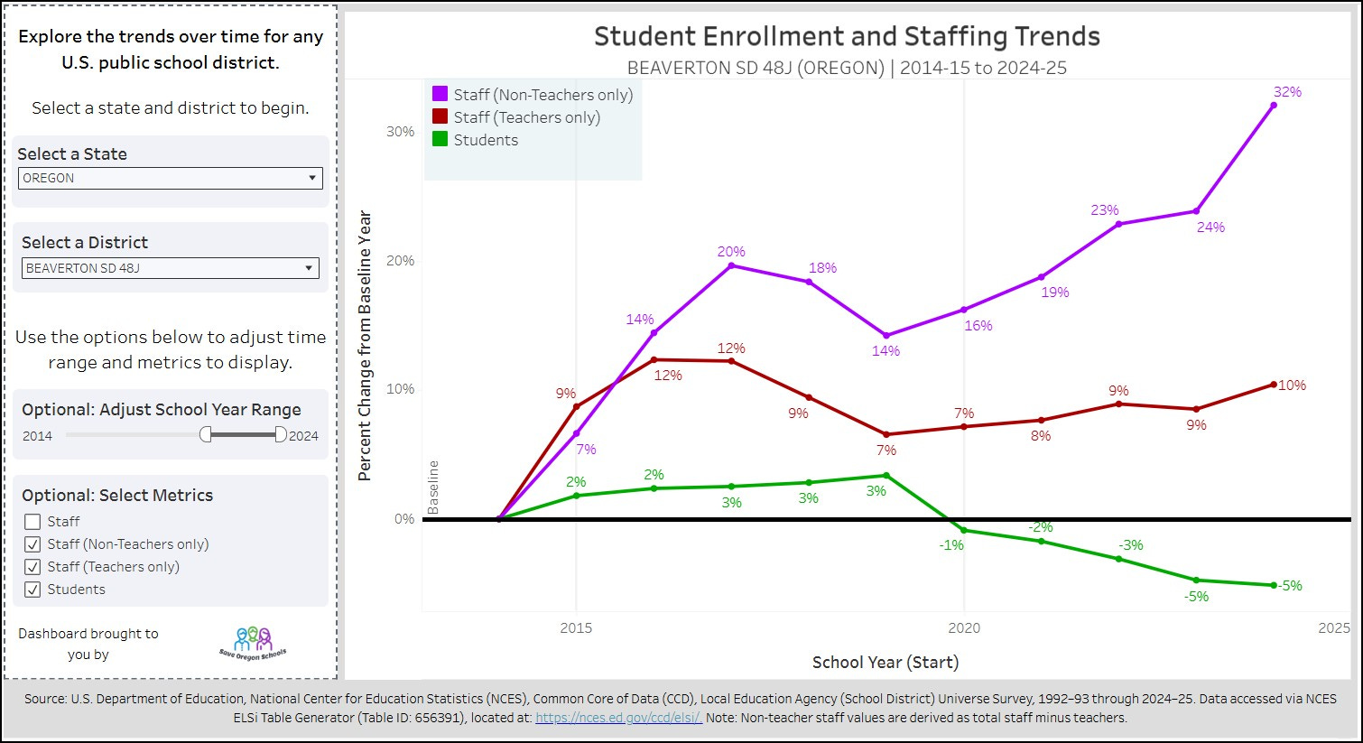
Two things really stand out to me in this chart:
They are increasing staff well beyond enrollment, even in the most recent years when enrollment has been declining
The vast majority of the additional staff are not classroom teachers
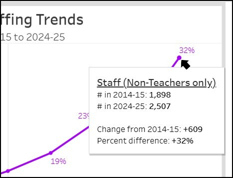
If you do want to see the numbers behind the calculations, just click/tap on any point on a line and you’ll see a pop-up box with the number from the “baseline” (the starting year selected) and the current year for what you selected.
What are you seeing?
This isn’t about proving a point. It is about making the conversation more grounded. If we’re going to talk about funding, staffing, and outcomes then we should start with a clear view of the relevant, historical information.
Ready to take a look at your district? —> https://bit.ly/staff-vs-students
I would genuinely like to hear about your experiences, including what you discovered and how you’ve put this newfound information to use. Feel free to share it in a comment here. If you post something on social media, consider tagging me too:
Facebook: @saveoregonschools
Instagram: @saveoregonschools
What about administrators or spending?
You may be wondering why I didn’t break out other specific roles like “administration” in this tool. The short answer is simplicity. The goal here was to keep this dashboard focused and easy to use.
If you want to go deeper, I built a another dashboard that may help (https://bit.ly/Pub-Ed-Dash). It includes three views:
Spending and revenue per student over time at the state level
Staffing by job category over time at the state level
Staffing by job category over time at the district level
In the staffing charts, each role is shown as a percentage of total staff for each year. That makes it easy to spot shifts over time, like whether the share of teachers is holding steady around historical norms or changing.

National Center for Education Statistics. (2024). Public School Expenditures. Condition of Education. U.S. Department of Education, Institute of Education Sciences. Retrieved March 21, 2026, from https://nces.ed.gov/programs/coe/indicator/cmb.
U.S. Department of Education, Nation Center for Education Statistics (NCES), Common Core of Data (CCD), Local Education Agency (School District) Universe Survey, 1992-93 through 2024-25. Data accessed via NCES ELSi Table Generator (Table ID: 656391), located at: https://nces.ed.gov/ccd/elsi/. Note: Non-teacher staff values are derived as total staff minus teachers.
I love this! I'm an Oregon teacher. But I'm not seeing where the data is coming from. Do you link to the spreadsheets somewhere?